The first part of the story is the "financialization of the economy." There are many ways to describe this phenomenon--looking at the ratio of financial assets to GDP, or the ratio of debt to income, and so on. But we thought this was the best way to show it.*
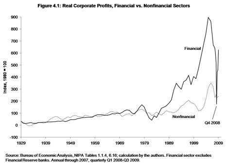
Those are corporate profits of the financial sector and the nonfinancial sector. It's an index, so the two lines are defined to intersect in 1980. Looking back from 1980, you can see that financial and nonfinancial profits grew at basically the same rate since the Crash of 1929. Then in the 1980s, financial profits took off into the stratosphere, defying even the crash of the stock market in 2000.
Remember that financial services are an intermediate product--that is, we don't eat them, or live in them, or put them on in the morning. They are supposed to enable a more efficient allocation of capital, so that the nonfinancial economy is more productive. But what we saw since the 1980s was the unmooring of the financial sector from the rest of the economy.
The right edge of the figure is also telling. That plunge in financial profits is Q4 2008--the three months right after the collapse of Lehman Brothers, Washington Mutual, and Wachovia. But then in the next three quarters, financial sector profits shot back up to the levels of the boom. That's called business as usual. And it's not what happened to the real economy.
If the hypertrophy of the financial sector wasn't good for the nonfinancial sector, whom was it good for? Bankers, for one. The chart below shows average annual compensation in the banking sector versus the private sector as a whole, in real (inflation-adjusted) dollars. There's no need to use an index, since from 1948 until 1980 bankers made the same as everyone else. Then their compensation shot up in almost a straight line, while everyone else's plodded along.
And this understates what really happened, because that upward jump did not happen because bank tellers or customer service representatives started making more. It happened largely because investment bankers (and, later, hedge fund and private equity fund managers) started making much, much more, to the point where it began to have distorting effects on our society and culture, such as a shift in the career preferences of graduates of top schools.
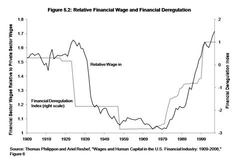
So one question to ask is: why did this happen? We go into that in depth in the book, but here's one picture, from a widely-cited paper by Thomas Philippon and Ariell Reshef. (That's with two L's--sorry it's wrong in the figure. It's right in the book.)
The dotted line is an index that the authors constructed of financial deregulation. The solid line is the ratio of average wages in finance to average wages in the rest of the economy. I think it speaks for itself.
So we have a deregulated financial sector, a highly profitable financial sector, and extremely well-paid bankers. What's wrong with that? Well, that's a debate that could go on for a while. For one thing, those high profits are largely the result of a high degree of concentration in certain markets (credit cards, mortgages, equity underwriting, derivatives, etc.), which means that there is not enough competition in the market. For another, look at this:
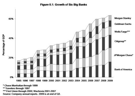
Those are the six largest banks today and their growth over the past fifteen years. This is what we mean by "too big to fail"--these banks, like Lehman Brothers before it, are so big and so interconnected that their failure could damage the financial system as a whole. As a result, they enjoy a widespread understanding that, in the event of a crisis, they would have to be bailed out by the government. This lets them borrow money more cheaply than their competitors, which means they will only get bigger and more powerful.
We're not saying that everyone has to agree with everything we say about these pictures. But they make clear what kind of financial system we have today. And they need some kind of explanation.
impressive pictures they are. But I’ve been particularly struck by one of them — this chart, from a paper by economists Thomas Philippon and Ariell Reshef, showing the close correspondence between deregulation trends on the one hand and the ratio of financial sector wages to private sector wages on the other. My reaction to the chart was essentially, Huh. Those trend lines look like the basic income inequality trend line.....But to my knowledge, no one has really made this point since the chart has circulated widely. Certainly no one has tried to illustrate it.
Maybe people just lack my whiz-bang PowerPoint and Excel skills, or maybe I’ve actually had an Original Thought. But take a look at the chart I created, which overlays a trend line showing the share of income received by the top one percent (the black line) on top of the Philippon-Reshef chart. The trend line comes from the widely cited work of economists Thomas Piketty and Emmanuel Saez, who used IRS data to look at the incomes of the very rich:
I’ve argued before that I think the Piketty-Saez top-share trend line overstates the recent rise in income inequality, but I don’t see much reason to doubt the basic U-shape of the trend since the Great Depression. For all of the consensus around the basic inequality trend, there’s surprisingly little agreement or understanding as to why it looks the way it does (a major theme of Paul Krugman’s Conscience of a Liberal). Could it really be as simple as the extent of financial regulation? Every analyst bone in my body says this is too easy, but…but….
Of course, saying it’s all financial regulation trends isn’t necessarily inconsistent with Krugman-esque arguments that it’s all about changes in cultural acceptance of inequality. Maybe financial regulation flows from public attitudes about inequality.
Anyway, interesting — no?


No comments:
Post a Comment